Instant download · Every resolution included · Personal use licence
Exposure
Home/The work

Case by case

Five that failed, and the number that sent them back

Arguments about whether an image "looks right" go nowhere. So they are not arguments here — every image gets opened in a script that reports luminance, the share of the frame that is dead black, clipping, and the ratio between colour channels. When a number is wrong the image goes back, however good it looked.

These five are the ones that fought hardest. What you are looking at in each case is the version that finally passed.

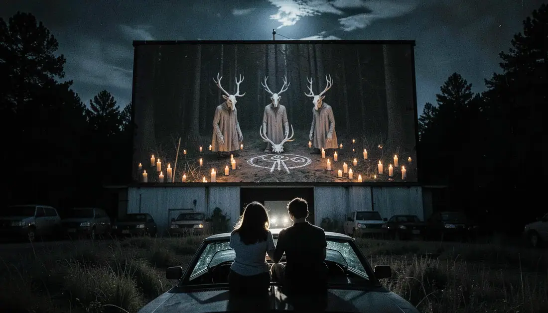
The Drive-In — from the pack nobody home

41%of the frame was pure black

The Drive-In

What was wrong

It came out of the generator looking cinematic on a phone and like a hole in the wall on a real monitor. Two fifths of the image held no information at all, and the couple on the car roof were brighter than the grass in front of them — which meant they read as two pale blobs instead of two silhouettes.

What changed

Dead black had to come under 8% of the frame and the couple had to go darker than their background. Six passes. What you see now still looks black on a phone; on a monitor the back row of cars is there.

See the pack it is in
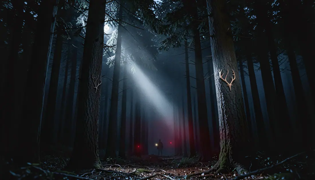
The Clearing — from the pack nobody home

35.8%dead black, and four eyes

The Clearing

What was wrong

Same problem as the drive-in, plus a worse one: the generator kept putting four glowing points in the treeline instead of two. Two eyes are an animal. Four are a rendering error, and once you see it you cannot unsee it.

What changed

Blacks lifted until the trunks separated from each other, and the eyeshine cut to a single pair set slightly too wide apart. That last detail is deliberate — it is the only thing in the image that is wrong on purpose.

See the pack it is in
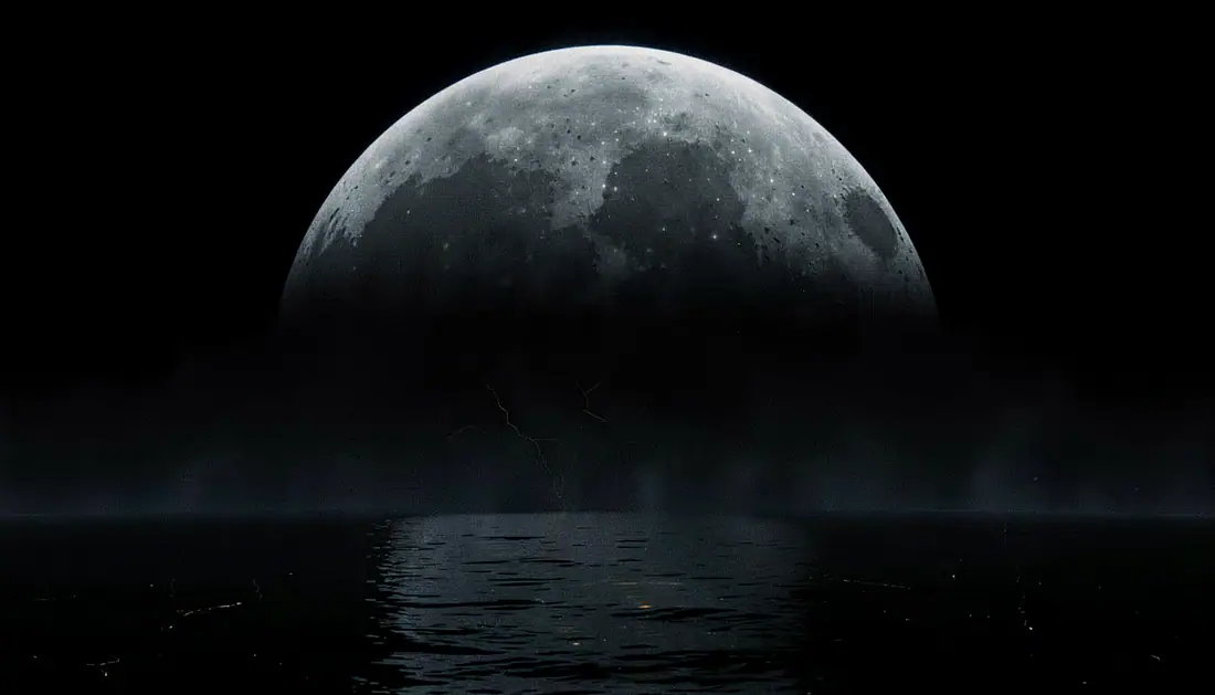
The Moon — from the pack the only witness

50%brightness at the limb

The Moon

What was wrong

The first version was lit evenly right across its face. A sphere lit that way does not read as a sphere — it reads as a flat disc stuck onto the sky, and no amount of surface detail rescues it.

What changed

A real sphere falls off toward its edge. This one went back until the surface at the limb sat at roughly half the brightness of the centre. Nothing else changed. That single number is the whole difference between a moon and a sticker.

See the pack it is in
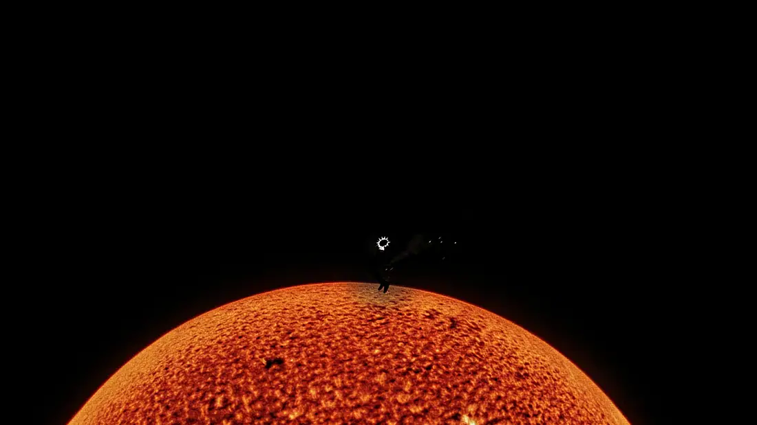
Too Close — from the pack the only witness

73%blue channel against red

Too Close

What was wrong

It was supposed to be the surface of a star. It came back the colour of cream. Eyes are bad at judging this — it looked warm — so the file went into a script instead, and the script said the blue channel was sitting at 73% of the red.

What changed

A photosphere is not orange until that number is close to zero. Pushed down, checked again, pushed down again. This is the clearest case in the collection of a measurement catching something the eye had already forgiven.

See the pack it is in
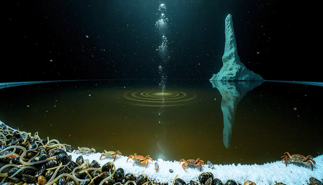
The Brine Pool — from the pack ocean deep secrets

3.6×brighter than the rest of the frame

The Brine Pool

What was wrong

The subject is the mirror: a lake at the bottom of the ocean, flat as black glass, doubling a spire. Except the salt rim along the bottom edge came out 3.6 times brighter than everything else, so every eye went straight to the bottom of the picture and stayed there.

What changed

The rim came down until the reflection was the loudest thing in the frame again. Composition is not only where you put things. It is also which of them is allowed to be bright.

See the pack it is in
EXPOSUREFrom €8
Browse